Why ClickUp Feels Bloated
One product trying to be ten — and you pay the cognitive tax.
ClickUp's pitch is 'one app to replace them all.' In practice it ships every feature its competitors have ever shipped, which means new team members can spend their first week learning what to ignore. The container types are fixed (Workspace → Space → Folder → List), and below a task, subtasks nest at most 7 levels deep. Taskpend goes the other direction: one uniformly nestable tree with no depth cap, and a small set of strong views over it.
Why switch
What Taskpend does that ClickUp doesn't
One hierarchy, not fixed container types
Workspace, Space, Folder, List — gone. Just nest, with no depth cap. Personal task or company-wide initiative use the same primitive.
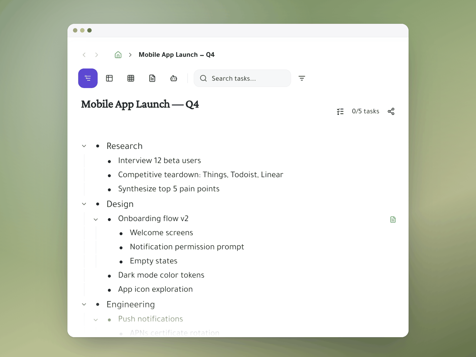
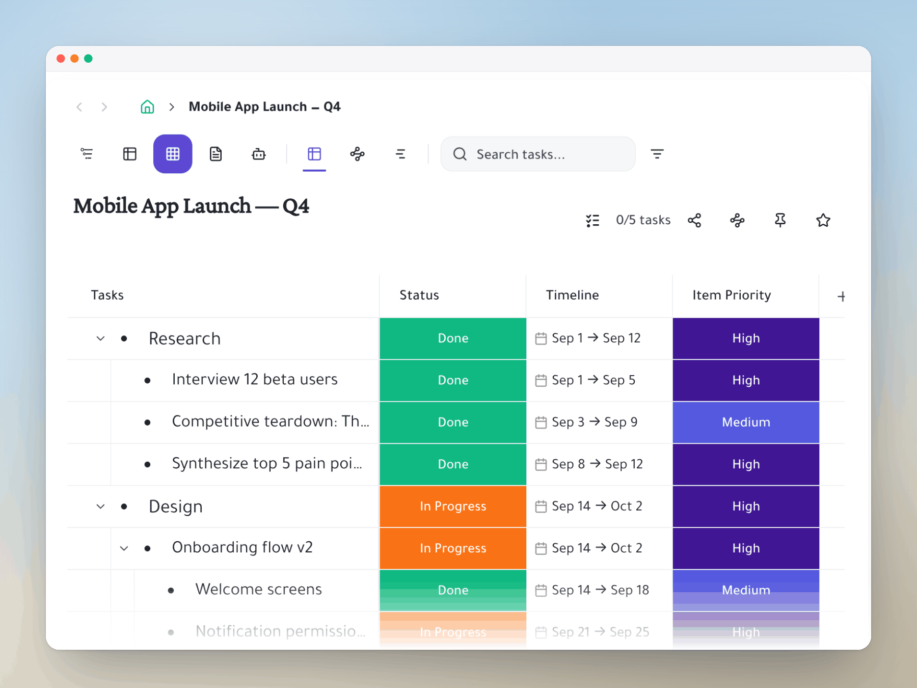
The views you'll actually use
Outliner, kanban, spreadsheet, gantt, document. Not mind maps, whiteboards, embeds, or chat that ends up unused.
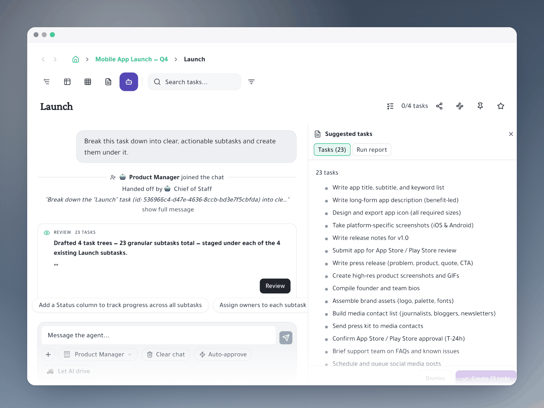
AI agents that work the tree
Built-in PM, engineer, and CEO agents that read your tree, write into the doc, break down tasks, and execute via integrations — included in the product, not sold as a separate add-on.
Feature comparison
Taskpend vs ClickUp
Ready to switch?
Start for free. No credit card required. Import your existing tasks in minutes.
Mirror a task into any project and it stays in sync everywhere.
Outliner, Kanban, Table, Gantt, Document and AI Execution chat — all on the same tasks.
No credit card required. Import your existing tasks and go.